A Step by Step Guide to setting up an AutoScaling Private WebPageTest instance

Update: November 2021
This article is out of date; there are no longer WebPageTest Server AMIs, so you need to install WPT on a base OS. The updated article is here WebPageTest Private Instance: 2021 Edition

If you have any interest in website performance optimisation, then you have undoubtedly heard of WebPageTest. Being able to test your websites from all over the world, on every major browser, on different operating systems, and even on physical mobile devices, is the greatest ever addition to a web performance engineer’s toolbox.

One small shelf of Pat Meenan's epic WebPageTest device lab

The sheer scale of WebPageTest, with test agents literally global (even in China!), of course means that queues for the popular locations can get quite long – not great when you’re in the middle of a performance debug session and need answers FAST!

Also since these test agents query your website from the public internet they won’t be able to hit internal systems – for example pre-production or QA, or even just a corporate intranet that isn’t accessible outside of a certain network.

In this article I’ll show you how to set up your very own private instance of WebPageTest in Amazon AWS with autoscaling test agents to keep costs down

Continue reading

Image Placeholders: Do it right or don’t do it at all. Please.

Hello. I’m a grumpy old web dev. I’m still wasting valuable memory on things like the deprecated img element’s lowsrc attribute (bring it back!), the hacks needed to get a website looking acceptable in both Firefox 2.5 and IE5.5 and IE on Mac, and what “cards” and “decks” meant in WAP terminology.

Having this – possibly pointless – information to hand means I am constantly getting frustrated at supposed “breakthrough” approaches to web development and optimisation which seem to be adding complexity for the sake of it, sometimes apparently ignoring existing tech.

What’s more annoying is when a good approach to something is implemented so badly that it reflects poorly on the original concept. I’ve previously written about how abusing something clever like React results in an awful user experience.

Don’t get me wrong, I absolutely love new tech, new approaches, new thinking, new opinions. I’m just sometimes grumpy about it because these new things don’t suit my personal preferences. Hence this article! Wahey!

Continue reading

The Tesco Mobile Website and The Importance of Device Testing

A constant passion of mine is efficiency: not being wasteful, repeating something until the process has been refined to the most effective, efficient, economical, form of the activity that is realistically achievable.

I’m not saying I always get it right, just that it’s frustrating when I see this not being done. Especially so when the opposite seems to be true, as if people are actively trying to make things as bad as possible.

Which brings me on the the current Tesco mobile website, the subject of this article, and of my dislike of the misuse of a particular form of web technology: client side rendering.

What follows is a mixture of web perf analysis and my own opinions and preferences. And you know what they say about opinions…

Client Side Rendering; What is it good for?

client side rendering frameworks

No, it’s not “absolutely nothing”! Angular, React, Vue; they all have their uses. They do a job, and in the most part they do it well.

The problem comes when developers treat every problem like something that can be solved with client side rendering.

Continue reading

Save 24% With The Last Frontier of Minification: HTML!

As a web developer, front end developer, or web performance enthusiast (or all of those), it’s likely that you’re already minifying your JavaScript (or uglifying it) and most likely your css too.

Why do we do this?

We minify specifically to reduce the bytes going over the wire; trying to get our websites as tiny as possible in order to shoot them through the internet faster than our competitor’s.

We obsess over optimising our images, carefully choosing the appropriate format and tweaking the quality percentage, hoping to achieve the balance between clarity and file size.

So we have teeny tiny JavaScript; we have clean, minified, uncssed css; we have perfectly small images (being lazy loaded, no doubt).

So what’s left?…

The ever-overlooked … HTML minification!

Thats right! HTML! BOOM!

Seriously though; HTML may be the one remaining frontier for optimisation. If you’ve covered off all the other static files – the css, js, and images – then not optimising html seems like a wasted opportunity.

If you view the source of most websites you visit you’ll probably find line after line of white space, acres of indents, reams of padding, novels in the forms of comments.

Every single one of these is a wasted opportunity to save bytes; to squeeze the last few bits out of your HTTP response, turning it from a hulking oil tanker into a zippy land speeder.

Continue reading

Lazy Loading Images? Don’t Rely On JavaScript!

So much of the internet is now made up of pages containing loads of images; just visit your favourite shopping site and scroll through a product listing page for an example of this.

As you can probably imagine, bringing in all of these images when the page loads can add unnecessary bloat, causing the user to download lots of data they may not see. It can also make the page slow to interact with, due to the page layout constantly changing as new images load in, causing the browser to reprocess the page.

One popular method to deal with this is to “Lazy Load” the images; that is, to only load the images just before the user will need to see them.

If this technique is applied to the “above the fold” content – i.e., the first average viewport-sized section of the page – then the user can get a significantly faster first view experience.

So everyone should always do this, right?

Before we get on to that, let’s look at how this is usually achieved. It’s so easy to find a suitable jQuery plugin or angularjs module that a simple install command later and you’re almost done; just add a new attribute to image tags or JavaScript method to process the images you want to delay loading for.

So surely this is a no-brainer?

Continue reading

Client Hints in Action

Following along from my recent post about responsive images using pure HTML, this post is about the more server-centric option. It doesn’t answer the art direction question, but it can help reduce the amount of HTML required to implement fully responsive images.

Client hint example site

If you are aware of responsive images and the <picture> element, you’ll know that the code required to give the browser enough choices and information in order to have it request the correct image can be somewhat verbose.

This article will cover the other side of the story, allowing the server to help with the decision of which image to show and ultimately greatly reducing the HTML required to achieve responsive images

Continue reading

Responsive Images Basics

srcset, sizes, and picture element

The term “Responsive Images” has been in common use for a while now. It refers to the ability to deliver the most appropriate image for the available viewport size, pixel density, even network connectivity.

For example, a Mac with a huge retina display is capable of displaying an extremely high resolution, large, image; whereas a phone in portrait mode on 3G may be better off with a smaller image – both in terms of dimensions and file size – which has been cropped to focus on the most important part of the image.

To achieve this required a significant amount of effort from the Responsive Images Working Group (RIWG) to help get functionality like the <picture> element and support for srcset and sizes attributes on both <picture> and <img /> into major browsers.

srcset

The srcset attribute allows us to define different sources for the same image, depending on the size and pixel density of the device’s display.

srcset’s “x” – pixel density (dpr)

So to display a different image for different pixel densities (e.g. standard definition or high def/retina) we might use something like:

<img src="img-base.png" 
    srcset="img-1x.png 1x, 
            img-2x.png 2x,
            img-3x.png 3x" />

The browser then decides which image to request based on the device capabilities (and potentially connectivity too).

Continue reading

Achievement Unlocked: OSCON 2015

I’ve recently returned from a fantastic week in Amsterdam for the O’Reilly OSCON conference

OSCON in Amsterdam celebrates, defines, and demonstrates the best that open source has to offer. From small businesses to the enterprise, open source is the first choice for engineers around the world.

Gruesome twosome

I thoroughly enjoyed presenting my Automating Web Performance workshop with the ever-epic Dean Hume at the Amsterdam RAI.

Amsterdam from our OSCON workshop room

Having a dedicated conference venu instead of just using a hotel was a master stroke; the venue was amazing, the wifi always worked, the food was plentiful and regular, our workshop room had a glorious view, and the general colour scheme changed from OSCON red to Velocity Conf turquoise as the conferences switched over mid week.

Continue reading

I’ll Be Speaking At OSCON EU

OSCON

I’m lucky enough to have been allowed to speak at OSCON EU this year, with – as per usual – the awesome Dean “Wrote The Book On Web Performance” Hume (that’s his legal full name, thanks to him having actually written a book on web performance).

OSCON – the Open Source Conference – “celebrates, defines, and demonstrates the best that open source has to offer.” From small businesses to the enterprise, open source is the first choice for engineers around the world, and OSCON is the place to celebrate that.

The workshop we’ll be presenting is Automating Web Performance – first thing on Wednesday morning.

As regular readers may notice, I do like my web performance optimisation – in fact, I’ve spoken about it once or twice.

What’s different this year is that .Net is finally open source, so, as long time .net-ers, we felt it was time to spread the .Net love amongst the open source community! I’m really excited for this conference – a different focus (I’m used to almost everyone at the conference talking about a similar thing to me – i.e., web performance optimisation – and the line up at OSCON is exceptionally diverse), a different location (the wonderful city of Amsterdam) and a different format for us (a 90 minute workshop instead of a 40 minute presentation).

We’ll be talking about tech that, although not specific to .Net, can be applied to such web projects – and to pretty much any other tech stack too – in order to reap the benefits of automated web performance optimisation.

We’ll go through automating the optimisation of images, css, javascript, and html, as well as introducing WebP images, critical css, unused css, and ultimately automating the continual testing of these optimisations.

It’s going to be a great start to the third day of the conference; if you’re attending, and you’re looking for something fun to start your last day with, then come and sit in with us – you won’t regret it!

If you’re not already attending and I’ve managed to convince you how wrong you are, then perhaps you’d also like to get 25% discount off of your ticket? How does that sound? And a cookie? Just use the code SPEAKER25 when you buy your ticket for that discount, and come find me at the conference for that cookie. *

(* cookie may not exist; the cookie is a lie)

EdgeConf 2015 – provoking thoughts.

edgeconf 2015 logo

Recently I was lucky enough to attend this year’s EdgeConf in the Facebook London offices.

Edgeconf is a one day non-conference all about current and upcoming web technologies, filled with some of the big hitters of the web development world and those instrumental in browser development.

The structure of an average section of Edgeconf is to give a brief intro to a topic which the attendees should be eminently familiar, then have everyone discuss and debate this topic, throwing out questions and opinions to the panellists or each other, such that insights can be gained as to how to better implement support in browsers, or what the web community could do to help adopt it, or decide it’s just something that’s not ready yet.

It’s very different to a normal conference, and is utterly engrossing. The fact that the attendees are hand picked and there are only a hundred or so of them means you end up with extremely well targeted and knowledgeable discussions going on.

I think I saw almost every big name web development twitter persona I follow in that one room. Scary stuff.

Having been fortunate enough to attend the 2014 Edgeconf, where there were some fascinating insights into accessibility and – surprisingly – ad networks not always being the baddies, I was looking forwards to what the day could bring.

Before the conference all attendees were invited to the edgeconf Slack team; there were various channels to help everyone get into the spirit as well as get all admin messages and general discussion.

During the day the slack channels were moving so rapidly that I often found myself engrossed in that discussion instead of the panel up in front of us.

Incredibly, every session – panel or break out – was being written up during, and presumably also after, the event, which is an achievement within itself. There was a lot of debating and discussing going on for the entire day, so hats off to those who managed to write everything up.

Hosted in the fantastic Facebook London offices, with their candy shop, coffee bar, and constant supply of caffeinated beverages, we were all buzzing to get talking.
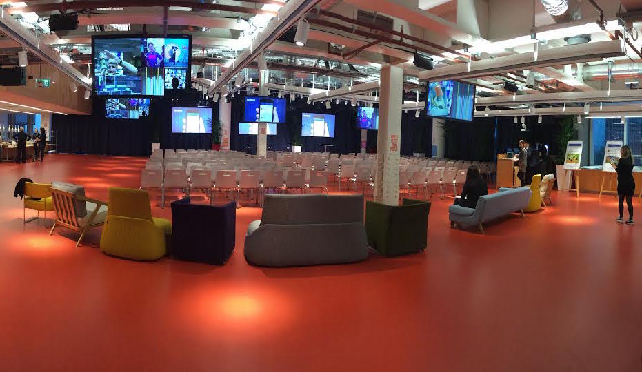
facebook

Panel discussions

The morning started in earnest with several panel discussion on security, front end data, components and modules, and progressive enhancement.

The structure was excellent, and the best application of Slack that I’ve seen; each panel discussion had a slack channel that the panel and the moderator could see, so the audience discussions were open to them and a few times audience members were called out to expand on a comment made in the slack channel.

When we wanted to make a point or ask a question, we merely added ourselves to a queue (using a /q command) and the moderator would ensure a throwable microphone made its way to us as soon as there was a break in the panel discussion.

These squishy cubes were getting thrown all over the crowd in possibly the most efficient way of getting audience participation.

These discussions covered some great topics. I’m not going to cover the specifics since there were live scribes for all of the events:, the notes for which can be found at the edgeconf hub – I only appear as “anon” a few times..

Break out sessions

After a break to re-energise and stretch, we could choose which of the 13 breakout sessions to attend during the afternoon (yes, 13!).

These were even less formal that the panel discussions, which really weren’t very formal anyway. They took some of the points raised on the relevant panel’s slack channel or the google moderator question list that had been circulated for several months prior to determine the panel questions also.

The attendees split into one of 4 or 5 sessions at a time, huddled around a table or just a circle of chairs, and with one person leading the main discussion points everyone tried to contribute to possible directions.

For example, we spoke about web components and tried to understand why they’re not being used more; same for service worker. These are great technologies, so why do we not all use them?

The sessions covered service worker, es6, installable apps, sass, security, web components, accessibility, RUM, front end data, progressive enhancement, network ops, interoperability, and polyfills.

Summary

Although Edgeconf will have their own next steps, my personal ones will appear as subsequent posts here. Some of the topics have inspired me to put down further thoughts .

The write up from co-organiser, Andrew Betts, is a great read.

Stay tuned!