A constant passion of mine is efficiency: not being wasteful, repeating something until the process has been refined to the most effective, efficient, economical, form of the activity that is realistically achievable.
I’m not saying I always get it right, just that it’s frustrating when I see this not being done. Especially so when the opposite seems to be true, as if people are actively trying to make things as bad as possible.
Which brings me on the the current Tesco mobile website, the subject of this article, and of my dislike of the misuse of a particular form of web technology: client side rendering.
What follows is a mixture of web perf analysis and my own opinions and preferences. And you know what they say about opinions…
Client Side Rendering; What is it good for?

No, it’s not “absolutely nothing”! Angular, React, Vue; they all have their uses. They do a job, and in the most part they do it well.
The problem comes when developers treat every problem like something that can be solved with client side rendering.
Are you building a single page application? Something that has a significant “chrome”, or surrounding area, that is constant throughout most operations, making the website feel more like an application?
Do you have two way data binding, where the user can change the state of an object, whose state can also be changed by another process or event?
Is a lot of your page made of lots of little dynamic elements, differing in content between users or environment state over time?
If you answered yes to any of these, then whoopee! You may as well go and play with the new fangled front end tech of your choice!
However, if you’re working on a blog, an article based content site, a brochure site, then you probably don’t need such powerful goodness.
No doubt some clever person has created a handy, cartoony, flow chart to help you decide if you should use client side rendering; if you find one please let me know!
Unfortunately these are all quite subjective comparisons, so I doubt I’ve managed to convince anyone who wasn’t sure which way to go. Also, there are a huge number of sites that fall between those two extremes; one of which is “e-commerce”.
The E-commerce Site
Having worked on e-commerce sites for over a decade (most of which was spent building ASOS.com from a classic asp site to the next few .net iterations) is where I gained a significant amount of my web development experience.
At its core, the e-commerce site inevitably consists of two core sections: browse and buy.
The “Buy” Section (Checkout)
The buy section is quite dynamic, containing your basket contents, your delivery and payment details, your order history perhaps; changing a delivery method may change other values and options, likewise for delivery address, or payment method.
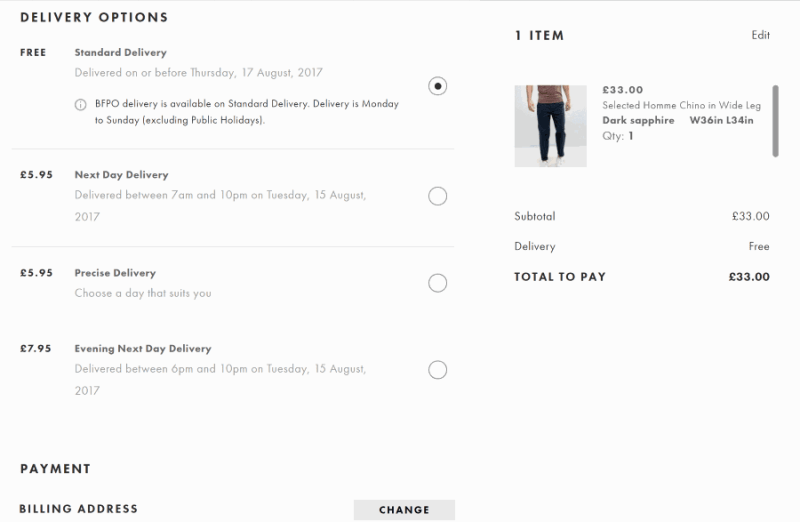
Lots potentially going on, especially if you’re trying to adhere to checkout “best practices” in terms of offering whatever is currently the most favourable user experience, such as keeping everything on one page instead of multiple checkout steps.
Given that on average an e-commerce site will generally get around 5-10% of the traffic converting from the browse section to the buy section (i.e., checking out), reducing how many calls a single page makes for optimisation purposes isn’t as big a concern as the browse section.
The browse section isn’t so obvious. It will probably consist of three page types: landing, listing, and detail:
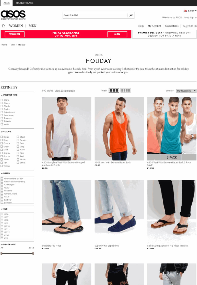
The Landing Page
Also called the category page, this is the shop department window (e.g. “men’s”, “women’s”, “festival store”, “Adidas”, etc), where certain brands, products, and product types are displayed and promoted.

Dynamic? Not usually. These could probably be static pages generated from a site generator or a CMS and pushed to a CDN; often they’re more content than products (i.e., more CMS than PIM).
You might display some basket content, but since pages these will likely get a lot of traffic from search bots and paid ads (PPC) due to their content and promotional objectives you’ll want to keep them as static as possible.
I’d suggest only loading dynamic basket content on a user event, like a click or mouse-over, and use your
robots.txtto block those URLs from crawlers; keep your servers as cool as a cucumber.
The Listing Page
Once you’ve chosen a product type from some sort of menu, you’ll not be surprised to see a product listing page.
Dynamic? Possibly; dynamic visual merchandising based on current user data and preferences can certainly result in better business metrics (average order value, lower bounce rate, higher conversion, etc) but for the sake of argument let’s assume everyone sees the same product listing for a given URL.
Again, basket info would be dynamic but could be loaded on a user event.
One thing Tesco, and many other e-commerce sites, do is to allow you to add items to your basket from the listing page. Tesco also highlight the added item, and show how many you currently have in your basket.
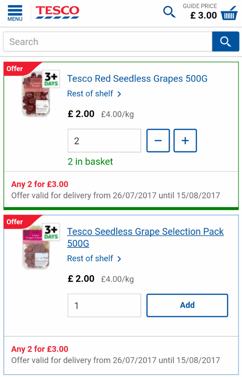
Maybe you want to hide items as they go out of stock, but this is a performance/user experience trade-off you’ll have to make yourself; I’d suggest saving stock level info for later in the journey.
The Product Detail Page
You found something wonderful on the listing page and now you want to know more; it’s the product detail page!
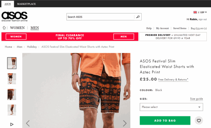
Dynamic? Getting there, sure. Should probably have stock availability here (though you could even save that until the checkout, if you value performance over user experience that much), and the ability to select from the product options: size, colour, fit, whatever, which could change other options on the page.
There’s a lot of scope for dynamism and personalisation on this page, especially around upsell and cross sell of related products: however none of these are in the critical path of getting the user to add the current product to their basket. As such, most of this page could be static, from a site generator, and pushed to a CDN.
I appreciate I’m being pedantic with a lot of this (and perhaps not very realistic) but beyond trying to prove a point I’m hoping you’ll take a moment and think about your own site; how much of it really needs to be dynamic? How much of it could exist in a static site generator, pushed to a CDN, avoiding your web server entirely? Hmmmmmm….. :)?
Where the magic happens
You know what’s reasonably reliable and consistent? Your web server and your Content Delivery Network’s hardware and (to a degree) the network immediately surrounding it.
You know what isn’t reliable and consistent? The end user’s device. The incredible diversity of different web capable devices is staggering, as is the variety of their hardware and capabilities.
What else? The network the end user is using. The applications that effect the traffic paying through their device. The space available on the device for temporary data persistence. The memory available.
All things that are pretty important when it comes to reliably creating a website.
You know what’s built for rendering HTML by binding data to layout? Your web server.
You know what isn’t (explicitly) built for rendering HTML by binding data to layout? The end user’s device.
This always brings to mind the Geoff Goldblum quote from Jurassic Park:
[They] were so preoccupied with whether or not they could that they didn’t stop to think if they should.
Yes, you can turn your user’s device into a web server; but should you?
What are you doing, Tesco??
This all brings me on to the subject of my ranting; the new Tesco groceries mobile website.
I do like a good mobile web site. Something fast to load and easy to use on a smaller, touch enabled, screen. Something that can handle flaky connections, as are all but guaranteed on a mobile device.
The current Tesco mobile website is not one of these, and it frustrates me so much, given that their previous site was at least functional, if not perfect.
It was recently updated with something that looks nicer and has larger, more thumb friendly, tap targets.
However, actually using it on a mobile device gave rise to some real usability issues; a listing page could hang and completely freeze, while still displaying the page “chrome”, adding an item to your basket would hang, meaning you’d tap again since you had no action confirmation, resulting in multiple items added. Attempting to view a basket containing more than a small number of items? Good luck with that! You’d be met with the page “chrome” and a loading spinner that never stops spinning.
Likewise, scrolling would halt and a drag to scroll would be interpreted as multiple taps, either adding unexpected items to your basket, or resulting in loading a random product detail page unintentionally.
Performance breakdown
Remind yourself of the page in question:
Most of these headline scores don’t look completely awful until you check the Speed Index and various Time To numbers.
Google pagespeed insights
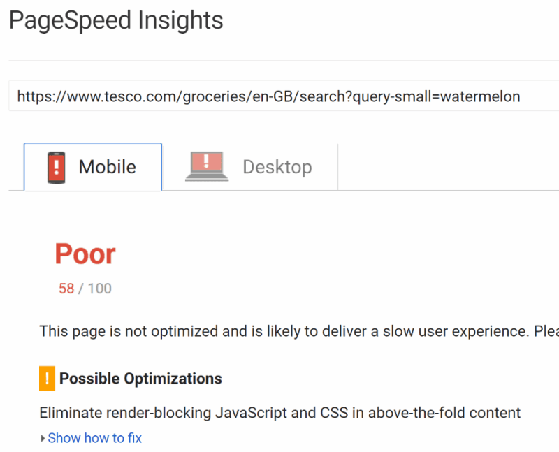
58 is Poor, but not utterly woeful; I’ve seen much worse.
Web Page Test
This is based on the mobile site, simulating a mobile device on a 3G network:
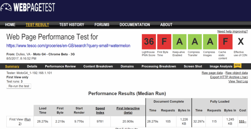
The poor Lighthouse score is to be expected; it’s not a Progressive Web App, nor does it pretend to be. Caching is a reasonably quick fix, so let’s not get hung up on that. The remaining “FAAA” rating isn’t too shabby.
However:
- Load time: 28 seconds
- Fully loaded: 32 seconds
- Start render: 9.7 seconds
- Speed index 9781 (remember that lower is better and >2000 is the holy grail)
- Time to first interactive: 20 seconds (ouch!)
So what’s going on here? A page weight of 1.2MB is below average (currently the average – AVERAGE – page size is OVER 3MB), so well done there; especially with an image heavy listing page. Where did these other nasty figures come from?
More on the stats
Let’s dig into the page a bit more; what is it made of? Bear in mind that, according to the HttpArchive, the average web page make up hovers around 60% images…
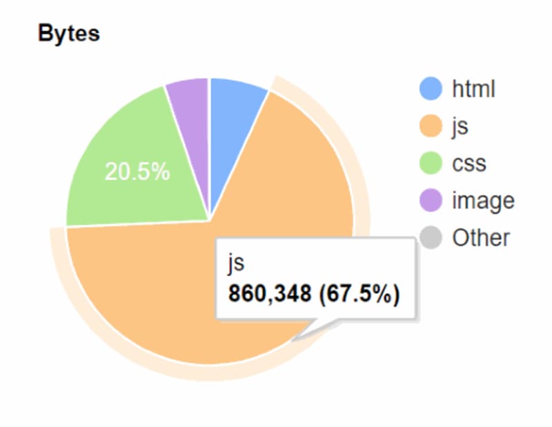
Wow: 67% JavaScript? That’s a red flag right there. If you’re loading that much script onto your device, surely there will be an impact on usability. Let’s find out…
Breakdown of processing
The main thread of your browser is spending an awful lot of time processing JavaScript:

Yikes. That helps to explain the significant “jank”. Your device is having to do a lot of unnecessary work to get this page to the screen.
Behind the scenes
I actually have nothing against React (other than the weird HTML-JavaScript syntax), but this is concerning:

You won’t be able to read that since it’s zoomed way way wayyyyy out, but the key takeaway is the scroll bar; the body tag doesn’t even appear until you scroll almost all the way to the bottom.
Over 70% of the page weight is data-props in the HTML tag. Then there’s another 10% of JSON config before we reach the body element.
Just think about how many round trips to the web server are needed in order to just get these packets of data over the network (a reliably unreliable 3 or 4G network, resulting in multiple “sorry, I don’t think I got that last packet quite right, can you resend it? Thanks!” TCP network chatter). All before the browser even sees a body tag. Ouch!
This is like someone kicking sand in the face of web performance nerds who like to aim for a critical path on that first load (i.e., squeezing “above the fold” content into the first one or two network packets).
The moral of this story: The importance of device testing
I’m not having a go at React/Angular/Vue in this article (I’ll save that for another one); here I’m pointing out what can happen when you focus on potentially the wrong goal.
By creating a fancy new website with probably completely reusable components, nicely packaged for consistent development, and probably well tested, no doubt with consistent coding conventions, Tesco dropped the ball on usability.
It’s obvious that Tesco didn’t do extensive device testing; on my wife’s reasonably decent iPhone 6, the same pages (with the same basket) on the same WiFi network are almost acceptable, in terms of interaction speed. On my Android Nexus 5X, it’s completely unusable. On a laptop running Chrome with developer tools set to pretend to be a Nexus 5X, everything seems completely fine. But my laptop is significantly more powerful, with way more memory, than the real device.
If you’re as big as Tesco, you can afford to buy, rent, or make a device lab. The Etsy team are an example of people who can show you how, and the fantastic Lara Hogan has co-authored a FREE book – Building a Device Lab which you should definitely check out.

If you can’t build one, then device labs are available to rent. Failing that, utilise WebPageTest device emulation and export the results to understand how much work is being done by the device.
Summary
I buy groceries regularly, like everyone else. I’m not in any way locked to one provider. I’ve used Tesco for years in spite of the mobile app being so bad that I had no option but to use the mobile site. But just releasing a bad version of a previously usable site is enough for me to change to one of the numerous competitors; I can’t imagine I’m alone in this – I wonder what effect this updated site has had on their business metrics?
If you take anything away from this rant, please let it be these two points:
- Don’t use new tech for the sake of using new tech; sometimes old and boring is the right answer, if not the popular one,
- If you’re building a web site for mobile devices, automate testing on real mobile devices.
Agree? Disagree? Meh? Opinions? Hit me up in the comments and over on Twitter.
Work for the Tesco dev team? I’d honestly love to chat with you! I’m sure you were doing the best you could with the tools you had in the time available.
Wow, this is a real interesting article. And highly applicable in todays tech and jobs market.
I’m a fairly decent web developer in terms of what I know, though I’d say I’m not quite at advanced level yet, and I’m genuinely passionate about the tech and am forever reading around the subject. Increasingly I’m seeing jobs for front end developers requiring heavy-weight js frameworks. The worrying trend is that they all seem to be wanting to use front-end methods to solve back end problems (the crux of the issue here possibly).
Is this all in the name of novelty? As you say, just because we can, doesn’t mean we should. The appetite of the tech consumer (in this case the business owner) demands the latest, greatest, move-iest, shine-iest, javascript-iest web sites that look flashy…but so often the user experience is severely impacted for the sake of these fairly pointless features.
As an example, I built a bus stop/time application [n.b. just saw your article on that from 2011!] – first all in jQuery and then with a split PHP backend and jQuery front end. The split PHP/jQuery version was so. much. faster – by around 3 seconds per request, even on a fairly light-weight app. I was actually a bit ashamed I was using PHP but having gone through the experience I would say let the server do the heavy lifting and use the front end languages for what they are meant to do – making your site user-friendly and pretty.
If you’re using a Javascript framework to manage multiple ajax calls to APIs etc per request you’re probably grinding your site to a halt on any mobile interface while the server loads are light and the company is losing money- especially, as you say, over cr*ppy networks etc.
Excellent article. Thanks!