Hello. I’m a grumpy old web dev. I’m still wasting valuable memory on things like the deprecated img element’s lowsrc attribute (bring it back!), the hacks needed to get a website looking acceptable in both Firefox 2.5 and IE5.5 and IE on Mac, and what “cards” and “decks” meant in WAP terminology.
Having this – possibly pointless – information to hand means I am constantly getting frustrated at supposed “breakthrough” approaches to web development and optimisation which seem to be adding complexity for the sake of it, sometimes apparently ignoring existing tech.
What’s more annoying is when a good approach to something is implemented so badly that it reflects poorly on the original concept. I’ve previously written about how abusing something clever like React results in an awful user experience.
Don’t get me wrong, I absolutely love new tech, new approaches, new thinking, new opinions. I’m just sometimes grumpy about it because these new things don’t suit my personal preferences. Hence this article! Wahey!
In case you’re not sure why web optimisation is a good thing: if you don’t have any problems with your internet connectivity, speed, and data usage, then you’re one of the privileged internet users and you most likely live in a tech bubble. Lucky you! Optimise for everyone who isn’t so lucky.
I Hate…
… BADLY IMPLEMENTED IMAGE PLACEHOLDERS
I thoroughly enjoy learning about new approaches to dealing with the scourge of the internet, the concrete shoes of the average web page, the source of almost all web perf articles, that is… (dun dun DAAAHH) – images!
I’ve written about various image loading techniques for improved web performance a few times, and I’ve spoken about it at a couple of conferences and a few meetups.
When you have a long page full of images, then deferring loading those that aren’t immediately visible gives your page an initial speed boost due to fewer requests and less data needed; just make sure you’re careful about how and when you load those deferred images though, in case you cause terrible jerky scrolling and layout juddering.
One approach that’s really, really, annoyingly, really popular at the moment is poorly implemented LQIP – or “Low Quality Image Placeholder”; a term used for approaches that display something extra skinny in place of the actual image that’s intended to be displayed, while waiting for the full fat image to be downloaded.
The original concept was written about back in 2013 buy the extremely clever Guy Podjarny whilst he was working at Akamai, in an article called Introducing Low Quality Image Placeholders .
Originally the Low Quality version of the image was meant to be a still recognisable version of the image, which completely makes sense:
Small Image – 5.2KB

Big Image – 15.6KB
Can you see the difference? Not so obvious, right? It’s significantly smaller in file size, but you can still see what the content of the image is.
LQIP gone wrong
Happy days. Guy has given us web perf nerds another great tool to add to the ever-growing toolbox! Let’s rejoice. Everything is well in the world and 5 years on we’re all benefiting. Or are we?..
So many sites and developers have taken this approach to the extreme, and made Low Quality Placeholders so low quality that they’re making the implementation of LQIP a worse experience than doing nothing instead.
For example, a Medium article image placeholder:
Small Image
What the?..
Big Image
OH I SEE….
What was the point in that? The placeholder was not representative of the final image, gave me no useful information at all, and on anything other than a super speedy connection I would have already scrolled away before it loaded. (Mainly because Medium combine LQIP with Lazy Loading. Sigh.)
The only times that I ever notice LQIP are on a slow connection (which makes sense). My grievances are:
- The placeholder image adds no value, since it’s far too low quality to represent the full image.
- The images are so different that when the full image loads in there’s a blip of mental load as you register a change in the page; this really annoys me as it takes focus away from the thing I was reading momentarily.
- I’ve usually almost scrolled past the image in question before it has loaded in, so I either gain no value from the image OR I find myself scrolling back up (ooh! shiny thing!) and losing focus.
I never actually see the LQIP when I’m on a decent connection (i.e., the full fat image loads in so quickly that the placeholder isn’t noticeable), so it’s only evident when it’s probably least useful.
So why do sites use LQIP (and other placeholder solutions)? Since the full image may take a while to load (we’re talking milliseconds – or possibly seconds, but hopefully not), LQIP would be a good idea when your images are so damn large that – even on a fast connection and high spec laptop – you will still have scrolled way past the image before it actually loads.
Case in point – most articles on The Verge website currently do this:
It’s the other side of this particular “poor web performance practise” coin: if one side is “badly implemented LQIP” then the other is “weird lazy-loading that’s not actually dealing with unoptimised images”.
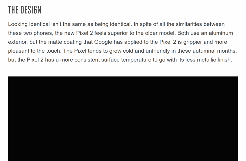
They have some horrible, JavaScript heavy, black pixel data uri placeholder solution weirdness that causes layout shifting when the image actually loads in and is so slow that the article is really annoying. Sigh. This site would actually benefit from a nice sprinkling of correctly implemented LQIPs throughout. Or… well… not doing anything and just let the images load. Or use progressive jpegs (which I’ll get on to soon!)
So, what should we be doing instead? Let’s review…
I Like…
… SETTING IMAGE DIMENSIONS
If you want to avoid the page jumping around as images are loaded in, changing the page flow, then set the image dimensions either on the element itself or in css; either way, the browser now knows how much space the image will take up and can lay the rest of the page out accordingly.
You don’t need to use a placeholder image to determine the page layout. Just set width and height in HTML or CSS.
… PROGRESSIVE JPEGS
In a progressive JPEG (or an interlaced gif/png) one image contains many scans of the actual picture at various levels of detail. Your device doesn’t need to download the entire file in order to start displaying something, and it could choose to stop loading the subsequent – higher detail – scans under certain conditions (low battery or poor connectivity, for example). They’re like built-in LQIP, but without extra JS functionality, CSS hacks, or extra images.
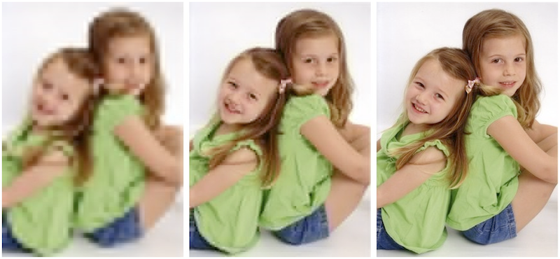
(picture borrowed from the excellent Book Of Speed website by Stoyan Stefanov)
The resulting image files can be slightly bigger than baseline jpegs (and non-interlaced gifs/pngs) in some cases, so be sure to balance this against any “placeholder” solution you may be planning to use.
However, there’s extra cognitive load (and some anxiety) with these approaches, as people aren’t sure when an image has actually finished loading. The difference between the 70% complete version and the 80% and 100% versions will be barely noticeable, so how can a user tell when an image is fully loaded? I mean, the point is that it shouldn’t matter, so long as the image is “good enough” as quickly as possible, but users still tend to wonder if the image is completed yet.
A baseline (or non-interlaced) image is much easier to know when it’s finished, but you won’t be able to see the actual contents of the image as quickly.
… WELL IMPLEMENTED LQIP
If you’re going to use low quality placeholder images, make them representative of the image they’re… uh… placeholding.
- Don’t use placeholders that are blurry, pointless, meaningless, rubbish.
- Do use placeholders that are somewhat smaller images than the originals (i.e. optimised to the point of not looking as good as you’d like, but still completely recognisable)
Think about the less privileged internet users out there; especially in the wake of the Net Neutrality upset – users might literally be paying more to see high quality images, even in your privileged tech bubble.
Consider high quality images a progressive enhancement; the page should be completely usable without them.
… NOT USING IMAGES!
Think about whether you even need to use images. Yes, images are worth a thousand words, but they might weigh more than that in kilobytes!
Here’s a quick “grumpy-old-web-dev” checklist to not wasting your user’s bandwidth/time/sanity:
Are you using images to enhance and explain your article or textual content?
Good work, carry on. Be sure to set alt attributes and image dimensions and all that. Be absolutely sure to optimise all the things too, obviously (right?)
Are you sending big hero images even to a low end device on a poor connection with low battery?
Don’t be daft. It’s wasteful for everyone involved; you pay for data transferred (at some point in the process) and they pay for data downloaded/battery used/time wasted. Remember Net Neutrality, right?..
Too old school for you?
Don’t fancy using progressive jpegs (or interlaced gif/png) and can’t bear to remove those lovely arty pictures of discarded shopping trolleys and whatnot? Try these alternatives:
picture
Go for the picture element with several srcsets defined. This allows your browser to decide to only download the most appropriate image.
<img src="img-base.png"
    srcset="img-120.png 120w,
            img-240.png 240w,
            img-1200.png 1200w" />
You can generate the image dynamically on your own backend (see my “client hints” github repo’s ImageController, mentioned below) or use a gulp or grunt task to do so prior to release.
Client Hints
Add in a Client Hints header – and even a Save Data header – being sure to actually check for the headers on the server (or in a service worker) to determine the response, then you can send only the most appropriate image for the client.
I’ve written about client hints before in some detail, even with an example implementation.
Summary
There are so many different approaches for loading images and giving a great user experience without impacting performance and speed; really think about your use case and implement the correct solution for that particular situation.
Consider solutions like:
- LQIP (with recognisable placeholder images)
- Progressive JPEGs
pictureelement withsrcsetattributes- Client Hint headers
- Save Data headers
Got some spare money? Use a CDN’s built in optimisations instead, saving you significant time and effort
- Akamai’s FEO
- Cloudinary’s… Uh… well, everything Cloudinary do, basically. They rock.
A great place to read about various solutions over the years is the annual Perf Planet Performance Calendar.
Got an opinion? Great, let me hear it. Like I said at the start of this, I love new approaches, new thinking, new tech – so I’d love to hear about yours.
Great article! First and foremost: layout jank is a bad and hard problem.
> Just set width and height in HTML or CSS.
Within responsive layouts, the only way to reserve space for squishy images is with hacky [aspect-ratio](https://www.bram.us/2017/06/16/aspect-ratios-in-css-are-a-hack/) [hacks](https://keithjgrant.com/posts/2017/03/aspect-ratios/). We need better ways to set [intrinsic](https://github.com/ResponsiveImagesCG/picture-element/issues/85) and/or [extrinsic](https://github.com/WICG/aspect-ratio) aspect ratios on replaced elements.
Second, as for what constitutes a good placeholder – I agree that *illegibly* blurry images can be frustrating. But the black boxes on the Verge, are, I think, better than if that space was simply blank. Having a subtle indication that “an image will show up here,” without triggering a guessing game of “what is that blurry blob going be?” is, to me, helpful. I suppose that means I favor the “placeholder” and “solid color” options on José Pérez’s scale of progressive techniques:
https://jmperezperez.com/svg-placeholders/
So I guess:
1. The first and most important job is to keep the rest of the content around the image from jumping around before/after load. As you say, you do not need placeholders for this (but it is harder than you let on).
2. After that, the important thing is to *set expectations* and not *raise questions*. For me, a solid (and I suppose preferably subtle) placeholder sets expectations, whereas blank space raises questions (“is this page just empty?” “is this a layout bug?”). And, as you point out, *illegible* reductions of the actual image content raise infuriating questions.
This only applies to small images. I don’t have the exact figures (it’s image dependant) but think smaller than 100×100 px. For larger JPEGs, progressive can be assumed to be the-same or slightly smaller than baseline.
Progressive JPEGs have a bad reputation for requiring more memory and CPU than baseline. However, this impact is negligible compared to some of the insane techniques people use to re-implement the same effects. You can also tweak the decode-pass instructions to create semi-progressive which lowers the number of passes and thus the memory and CPU impact.
You can convert an existing JPEG image from baseline to semi-transparent losslessly. There is no excuse not to check it out!
https://www.ctrl.blog/entry/jpeg-progressive-loading.html